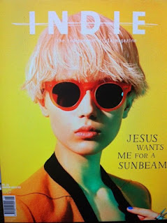
Magazine practical task
Planning
Idea 1:
Side view shot of vape, vape is multicoloured with a background of a different hue. Vape and wall are cut to form different layers.
Idea 2:
Same idea as above but with different hues and a front view shot.
Idea 3:
Front shot of my standing with scribble art outline and also different scribble art designs.
Idea 2 is my preferred Idea as I believe it's more interesting.
The shot will contain me (actor) in casual clothing with natural lighting from the right, the shot will also contain vape as a prop.
 |
| I would like to use this kind of framing with similar colours |
 |
| This colour scheme with a psychedelic theme |
 |
| I enjoy the look of old music magazines, the look and lighting is something I want to mimic for my magazine. |
Planning
1) The idea is going to be around mental creativity and freedom
2) I will need a forward facing shot with vape covering my face, the shot will also have the smoke and the wall having different hues to give a psychedelic feeling to the image.
3) PSYCHEDELIC FANTASIES
THE INDEPENDENT FASHION MAGAZINE
4) Sketch out your cover on plain A4 paper using your written planning. Take a photo of your sketch and embed it in your blogpost.
Publication to blog and analysis
2) Write an evaluation of your work: have you succeeded in your brief to create a new, original edition of an existing magazine?:
I do believe that I have managed to create a new original edition of a magazine, the main inspiration for the magazine cover was INDIE magazine, their designs and colour schemes were something I wanted to replicate but with my own twist to it. While the coour scheme may not stand out as much as INDIE magazines may, I do believe I managed to capture the same minimalistic design as other covers.
3) Put your cover alongside a couple of genuine covers of your chosen magazine. How professional is your work alongside genuine examples?
The colour schemes from INDIE Magazines are far more professional, along with that I do believe that the positioning of the text and the overall design from INDIE Magazines is far more professional looking. But overall I do believe I have managed to create a relatively professional looking magazine cover.
4) What is the strongest aspect of your work?:
I believe that the overall design is the strongest aspect of my work, the colour scheme and maybe the font used could be improved on.
5) What is the weakest aspect of your Photoshop magazine cover? :
There are a few mistakes with the making of some of the layers, and maybe I could have used a better colour scheme.
6) What would you do differently if you completed this assignment again?
I would maybe choose a better colour pallet and may spend more time ironing out the small mistakes


Comments
Post a Comment